%20(5).png)

Product architecture, brand system, and digital platform.
Designing a scalable water product ecosystem - from physical hardware to digital experience.
Designing a scalable water product ecosystem - from physical hardware to digital experience.
CLIENT: Water Source Solutions
INDUSTRY: Water Filtration & Hydration Systems
SCOPE: Brand system • Product architecture • Hardware • UX/UI design • Website design • Marketing • Product naming & content
ROLE: Creative Director & Lead Designer
The product lineup relied on internal model numbers that were difficult for customers to understand. Products, services, and benefits were fragmented across the website and sales materials, making the system hard to navigate.
Instead of treating this as a website project, the work focused on designing a coherent product system that could scale across physical products, digital touchpoints, and future offerings.
Strategic priorities
• Clarify the product ecosystem.
• Create a modular brand and UI system.
• Ensure consistency across physical and digital experiences.
• Make technical water systems understandable to non-technical users.
Product identity
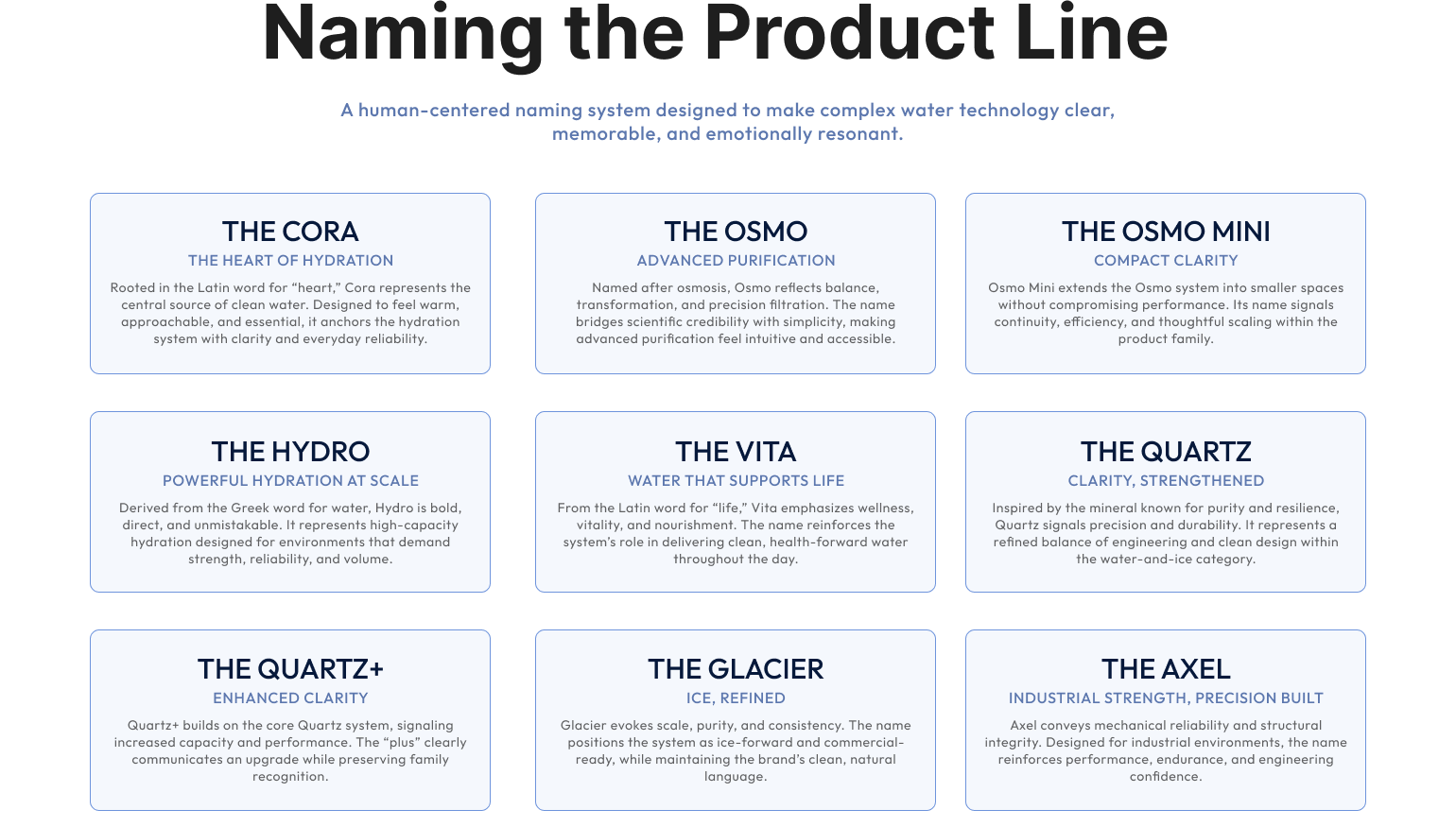
Developed a product naming and classification system to simplify differentiation and support long-term scalability.
UX/UI design
Led the end-to-end design of the website experience, including navigation, information architecture, and product workflows.
Content & copy
Structured complex technical information into clear, accessible language that supports customer understanding and decision-making.
Print materials
Designed supporting sales collateral aligned with the digital system to ensure consistency across marketing and outreach.
Established a structured product naming and classification system, redesigned the website experience, and created a unified brand and communication framework across digital and sales materials.
The product naming architecture has been implemented across the company’s product line and is actively used in sales presentations, print materials, and marketing communications. The new website and digital platform are currently in development, built on the product architecture, UX framework, and brand system established through this work.
.png)
.png)

Shout out to Sarah Kavka at Water Source Solutions for her leadership, creativity, and trust.
.png)
.png)
.svg)
.png)


